Anushka's Eportfolio
Unit 1: Laser Cutting
Design Brief
In the Design Brief, we started planning our final print by first coming up with a fake client. I used fakeclients.com for inspiration and made some modifications to the suggestion given by giving it my own tweaks and so. Then, in the design brief, I briefly stated what I was going to create (business card) and if I had a vague idea of how I was going to incorporate layers into my final design. The design that I imagined was loosely based on a reference, which I used in my citations as one of my sources. I also went through possible color schemes appropriate for the client's product, as well as materials and possible more intricate designs that I could incorporate into the business card that I was making. I then connected my inspiration to my citations and why the reference was essential for coming up with a design for the business card.
Design Specification
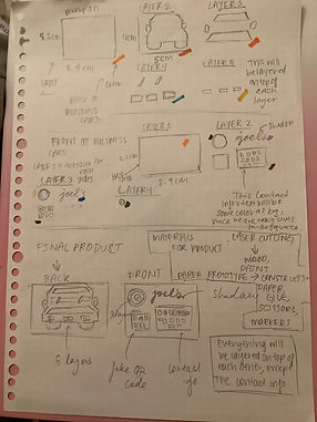
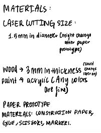
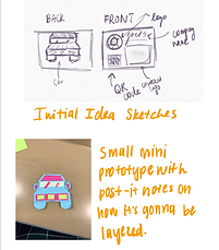
In the Design specification, it was the same thing as the design brief, but more in-depth. Meaning that the Specification included more measurements, color schemes, and more details on which layers are 1st, 2nd, etc. It also goes through the materials that we need, and the sizes of the laser's diameter, meaning how thick the lines will be engraved on the paper, as well as different sketches depicting the different layers. On the Specification, I said that I would use wood as the base, and gave the wood's thickness. But then I realized that with these many layers, It would be more practical to use paper instead of wood, and I was making a business card so it would make more sense using paper, and instead of painting wood, I would just use different colors of paper. Since I had many layers, showing them in a sketch was a little difficult so I decided to make a small post-it note prototype so how the layers worked, could be understood better.

Test Print
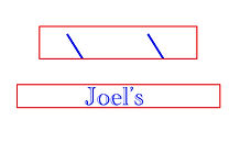
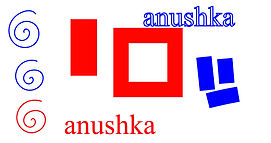
The Test print was the first time using illustrator and actually printing designs from it. The test prints were just to see if the prints would come out nice, and what strokes to use on the illustrator as well as identifying that red stroked means it's cutting as blue strokes mean that the laser is only engraving.. After having our test prints, we realized that we can't use the fill option for the lines that we made, but only use the stroke option. As you can see on my test print, the blue square was too thick because I used fill for the brush strokes, and since it's blue, the printer cannot engrave that thick lines into the paper therefore the lines came out much thinner that the shape in illustrator. I also learned that only a few brushes on the program are actually identified on the printer. The test prints were a good experiment and learning lesson before we needed to know the precautions of when we actually print.
Final PrinT
Reflection
In my final print, I had 3 layers, and on the 3rd layer, I engrave the company's name: Joel's. The final print is extremely oversimplified than the one that I designed in the design specification, but after working on it for a while, I decided that having that many layers and having the business card double-sided would be too many layers to print and complete all those layers on time, with each layer an intricate shape, would be quite difficult to submit. In reflection, I realized that If I were to make the design more complicated, would have to dedicate much more time to it, and I underestimated how much time illustrator designs can really take, especially with intentionally detailed designs. In general, I think I should've utilized my time more and tried something a bit simpler since using the laser cutter was still sort of a new experience, as well as using illustrator as a tool was also quite difficult to utilize, and because of the may function, it was also hard to navigate. In general, I think I underestimated how much time laser cutting can take and I am making sure that I apply this knowledge to my next laser cutting assignment.
Layer 1(color Yellow)
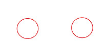
Layer 2(color muted red, overlapping with the layer 1 circles creating semi-circles)
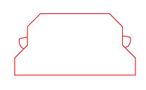
Layer 3(orange)